On Wednesday, via press release, the second iteration of the adidas x MLS Archive Collection was revealed. This special third kit draws on ‘90s nostalgia, employing bold designs, throwback logos and motifs from myriad sources. While paying homage to some clubs legacy, it’s also a shrewd marketing move to drive revenue.
Last year’s debut archive kits featured Inter Miami CF, two Los Angeles teams (Galaxy & LAFC), Portland Timbers and Sporting Kansas City. This season’s participating clubs include: Charlotte FC, Colorado Rapids, Columbus Crew, D.C. United, FC Dallas, Minnesota United, Nashville SC, New England Revolution, San Jose Earthquakes and Seattle Sounders.
This lady loves a good throwback, but please note the “good.” Some meet that threshold; some do not. I’ll be evaluating each kit and providing a grade from A to F.
Charlotte FC
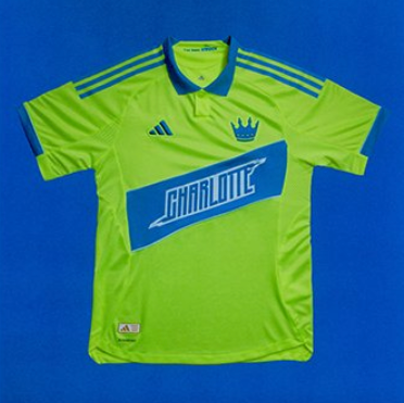
As an expansion club, Charlotte has no real legacy to build on. That makes this kit quite blah, other than that neon green. I do like the prominent crown logo.
Grade: C-
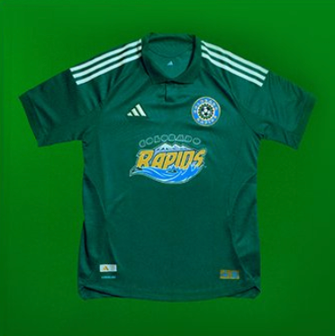
Colorado Rapids
This one rocks, and not just because of the retro mountain logo mounted boldly in the center. The return of the original forest green color gets a thumbs up.
Grade: B+
Columbus Crew
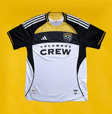
As one of the original ten MLS clubs, the Crew bring back their classic hardhat logo and revert to a retro font, all couched in a design that vaguely resembles a helmeted human silhouette.
Grade: B
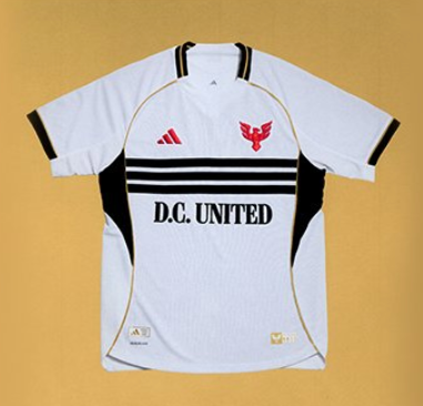
D.C. United
This is how retro is done right. The kit is super clean but bold, with the old logo in bright red. The black stripes and gold trim evoke the swagger of that ‘90s side that dominated the early years of the MLS. Grace: A-
FC Dallas
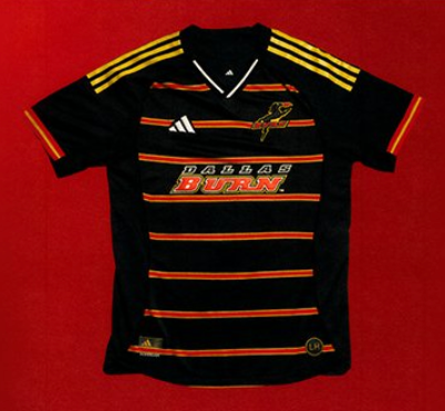
Here’s a good example of why some retro kits should remain memories. This is just ugly. The horizontal stripes are too busy and the gold striping on the shoulder doesn’t fit. No issues with the original team name and flaming stallion logo. Grade: D
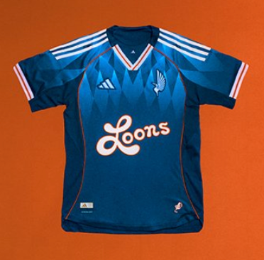
Minnesota United
Minnesota is only ten years old, so this is more a retro fantasy than real revisiting. But it really works. The light blue rhomboids look sharp, and that stylized, cartooning Loons logo is comically awesome.
Grade: B
Nashville SC

Throwing out their yellow & black pastiche, Nashville time-travels back to a simpler era of white and sapphire blue with aqua trim. It’s clean, but that logo is more ‘70s than ‘90s and doesn’t quite fit.
Grade: C-
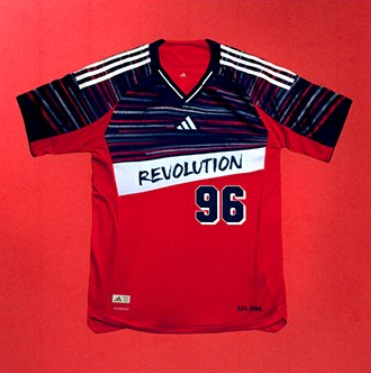
New England Revolution
I should hate this, but I don’t. The asymmetrical red, white and blue hashing in the top is kinda flash, and the solid red bottom firmly anchors it. The simple paintbrush-style logo really works, and the big “96” harkens back the Revs’ original club status.
Grade: B
San Jose Earthquakes
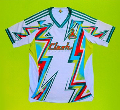
Oh lord, no. This is retro at its worst. The original San Jose team moniker was the Clash, and this kit clearly channels that vibe. I do like the scorpion logo, but it’s lost in the neon lightning bolts.
Grade: D-
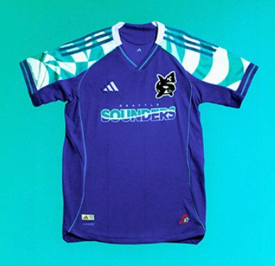
Seattle Sounders
They call this the “Orca” kit, due to the prominent cetacean logo. The color scheme harkens back to the A-league Sounders, with the aqua and white pattern evoking shoreline waves.
Grade: B
